

This website follows WCAG 2.1 AA guidelines for accessibility. Use Tab to navigate, Enter to activate links, and arrow keys in menus.
Our vision is to drive the School towards Sustainable Practices and provide something which is dynamically different. Hence, as a premiere Institution we symbolise our beginning into the new era of Architecture and Planning. A symbol, which represents the Institute, imparting and disseminating education and research following strong principles in the fields of Architecture and Planning.
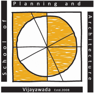
In our LOGO, the MOTHER EARTH is represented by the circle emphasizing the lovely Life on earth which gave birth to Architecture. The earthen yellow represents the fertility of the soil of the Vijayawada region, celebration of the human civilization and brightness towards the future directions. The white streaks inside the yellow represent the Krishna River, a vital source for the region. The contrasting white and yellow colours within the circle represent the duality of day and night and the progression of the time scale.
The vertical tilted line along the circle represents the angle of tilt of the earth's vertical axis to the plane of the eclectic at an angle of 23.45 degrees which gives us the four seasons of the year-spring, summer, autumn and winter.
The square inscribing the circle represents the Vasthu Purusha Mandala. Here, the SQUARE or the Chaturbhuji apart from being one of the fundamental forms also resembles the surface of the earth as per the Hindu Mythology.
The four strong bold boundaries around the square resemble Discipline, Dynamism, Determination and Unity in the fields of Architecture and Planning which binds us in this place for learning. The SQUARE here is the symbol of enlightenment of architectural and planning education.
"World is here and within" "Earth is our boundary."